We are just now hitting the holidays season for 2012, so it may seem premature to think about 2013. But now is the time to start ordering supplies for upcoming Pantone Spring Colors 2013.
Combining the bright pops of colors that will draw attention with natural, neutral tones will be a huge hit.
The tender shoot greens are nice light greens that represent all the new growth that occurs in the Spring.

Tender Shoots Beads
Grayed Jade is a more subtle, calming green that is perfect for a neutral tone with these pops of colors!
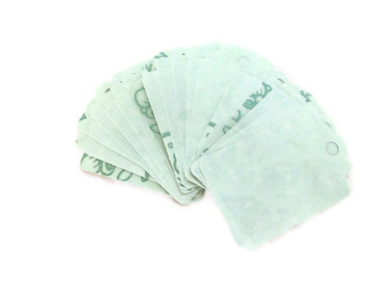
Grayed Jade
Emerald is a vibrant green that brings about a sense of well-being.
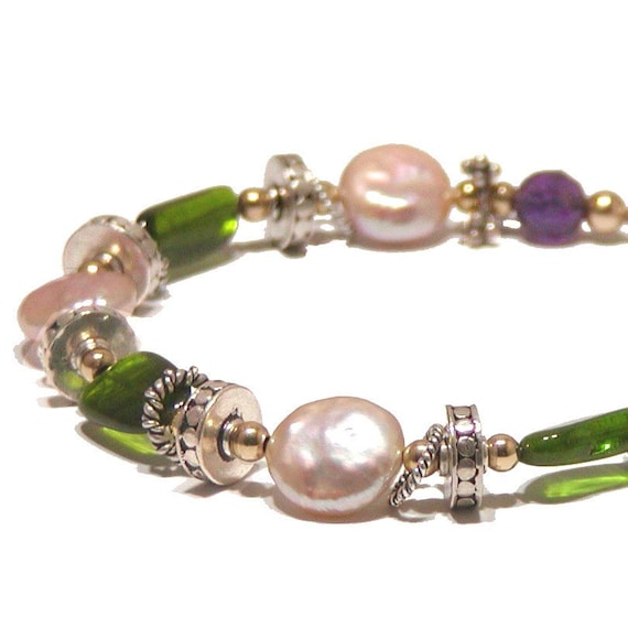
Emerald Combined with Linen Neutral tones and African Violet
Pantone recommends designs that would combine all 3 greens into a balanced design of vibrant tones and calming tones! A monochromatic design with these shades are sure to be popular!
African Violet is meant to be a statement color/piece. And could be quite intriguing when combined with the bright Poppy Red.
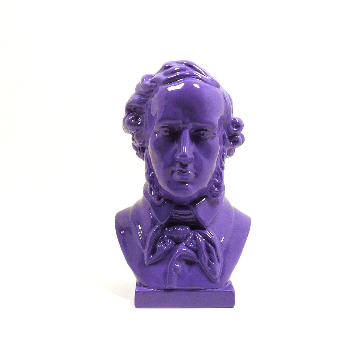
Poppy Red is described as sensual, and seductive.
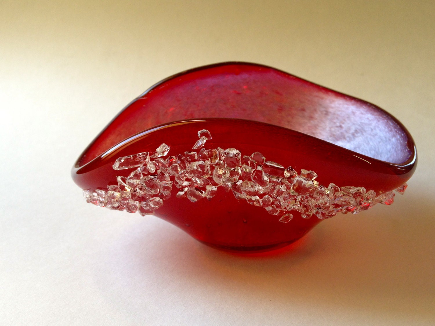
Poppy Red
"Nectarine, a bright, effervescent citrus orange with coral undertones, provides a tangy burst of flavor while cheerful Lemon Zest brings out a piquant taste with its refreshing, spritely greenish cast." (http://www.pantone.com/pages/fcr.aspx?pg=21006&ca=4)
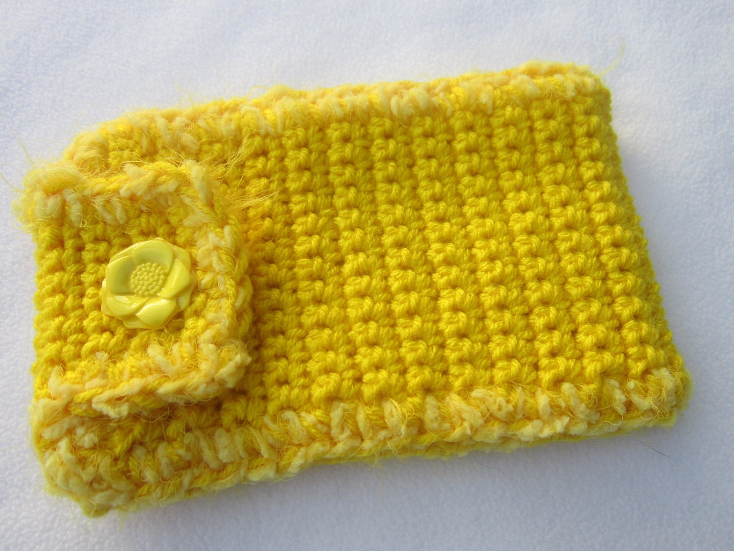
Lemon Zest
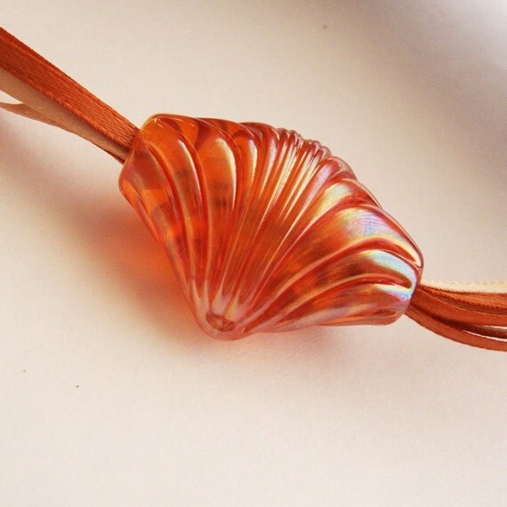
Nectarine
Dusk Blue is meant to be calming and is a great choice for a neutral tone against any of these pops of colors.
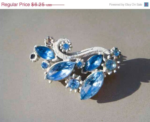
Dusk Blue
Linen is a basic that all wardrobes need. It is a warm, neutral tone to use in all designs.
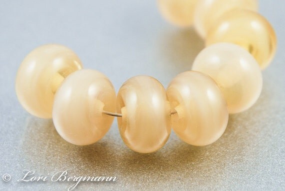
Linen
Lastly, Monaco blue is a classic shade that will provide stability and depth to any design.
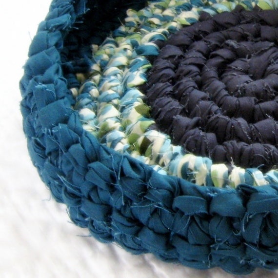
Monaco Blue
Can't wait to see all the new designs to come with this color palette. Make sure you tag your items and title them with these key terms to help buyers find them!
Etsy Promo Frenzy Team
Combining the bright pops of colors that will draw attention with natural, neutral tones will be a huge hit.
The tender shoot greens are nice light greens that represent all the new growth that occurs in the Spring.

Tender Shoots Beads
Grayed Jade is a more subtle, calming green that is perfect for a neutral tone with these pops of colors!

Grayed Jade
Emerald is a vibrant green that brings about a sense of well-being.

Emerald Combined with Linen Neutral tones and African Violet
Pantone recommends designs that would combine all 3 greens into a balanced design of vibrant tones and calming tones! A monochromatic design with these shades are sure to be popular!
African Violet is meant to be a statement color/piece. And could be quite intriguing when combined with the bright Poppy Red.

Poppy Red is described as sensual, and seductive.

Poppy Red
"Nectarine, a bright, effervescent citrus orange with coral undertones, provides a tangy burst of flavor while cheerful Lemon Zest brings out a piquant taste with its refreshing, spritely greenish cast." (http://www.pantone.com/pages/fcr.aspx?pg=21006&ca=4)

Lemon Zest

Nectarine
Dusk Blue is meant to be calming and is a great choice for a neutral tone against any of these pops of colors.

Dusk Blue
Linen is a basic that all wardrobes need. It is a warm, neutral tone to use in all designs.

Linen
Lastly, Monaco blue is a classic shade that will provide stability and depth to any design.

Monaco Blue
Can't wait to see all the new designs to come with this color palette. Make sure you tag your items and title them with these key terms to help buyers find them!
Etsy Promo Frenzy Team


This post is giving me Spring Fever, and it's a little early for THAT ;D
ReplyDeleteI love these colors!!!
I love these colors too it really inspires me for upcoming designs!!!
ReplyDeleteAND ***** HINT ***** All of you guys featured here should make sure to title and tag your items with these keywords and colors for extra traffic :)
What a great article—I'm really digging the brights mixed with the neutrals! Thanks so much for including my lampwork beads in the Linen section too! *Ü*
ReplyDeleteWhat a beautiful selection of items with gorgeous color! Thanks so much for including my sunglass case. The other items would be perfect for holiday giving!
ReplyDeleteI love the spring colors! Great product selections for them too!
ReplyDeleteBeautiful colors!
ReplyDeleteSuper information. Following some of these color trends will keep our items fresh and trendy. Gone are the days where certain colors are always locked in to a traditional partner and specific season. Love the change in thinking.
ReplyDeleteThank you for featuring my shop!! Gorgeous finds!!
ReplyDeleteI am Inspired for next year now :)
ReplyDeletesuch wonderful colors and inspirations!
ReplyDeleteBeautiful Colours - I already have plans to use some of them
ReplyDeleteThanks for the color charts... will have to do some creating to reflect those.
ReplyDeleteGreat article, thanks for the examples.
ReplyDeleteGorgeous colors and beautiful article. Thank you so much for sharing.
ReplyDeleteWow, everything is so lovely! And I love the new color pallet!
ReplyDeleteLovely! I love looking at the Pantone colors. This particular set makes me feel happy when I look at it. I love Amy's basket! It does look like "monaco blue" too!
ReplyDeleteUnique Cozy Treasures - Great Information! Love the Pantone colors!
ReplyDeleteThanks for sharing the Spring 2013 Pantone colors! I will certainly keep this color palette in mind as I begin to create items for the Spring!
ReplyDeleteThanks for sharing these colors! Good to have this info so early.
ReplyDeleteomg I love this set of colors so trendy and fun!
ReplyDeleteBeautiful! Love the items you choose to depict the spring pantone colors.
ReplyDeleteI love all these colors! Thanks for including my gift tags! :)
ReplyDeleteI just read about Morocco Blue being named the color of the year for 2013. Thank you for sharing more information on spring color trends!
ReplyDeleteThe colors are great. Thanks for sharing.
ReplyDeleteI love this post. It gives me incentive to start working on things for spring! Thank you!
ReplyDeleteThis is amazing. Love all the gemstones
ReplyDelete